Saturday, October 19, 2019

What are XAML Controls?

The XAML User Interface framework offers an extensive library of controls that supports UI development for Windows. Some of them have a visual representation such Button, Textbox, TextBlock, etc.; while other controls are used as containers for other controls or content, for example, images. All the XAML controls are inherited from System.Windows.Controls.Control.
The complete inheritance hierarchy of controls is as follows −
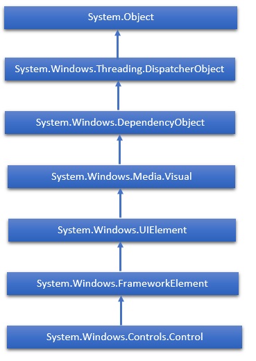
Controls Hierarchy

Views for presentation

BoxView

Displays a rectangle of a particular color.
Screenshot of a BoxView
<BoxView Color="Accent"
         WidthRequest="150"
         HeightRequest="150"
         HorizontalOptions="Center">

Image

Displays a bitmap.
Screenshot of an Image
<Image Source="https://aka.ms/campus.jpg"
       Aspect="AspectFit"
       HorizontalOptions="Center" />

Label

Displays one or more lines of text.
Screenshot of a Label
<Label Text="Hello, Xamarin.Forms!"
       FontSize="Large"
       FontAttributes="Italic"
       HorizontalTextAlignment="Center" />

Map

Displays a map.
Screenshot of a Map
<maps:Map ItemsSource="{Binding Locations}" />

WebView

Displays Web pages or HTML content.
Screenshot of a WebView
<WebView Source="https://docs.microsoft.com/xamarin/"
         VerticalOptions="FillAndExpand" />

Views that initiate commands

Button

Displays text in a rectangular object.
Screenshot of a Button
<Button Text="Click Me!"
        Font="Large"
        BorderWidth="1"
        HorizontalOptions="Center"
        VerticalOptions="CenterAndExpand"
        Clicked="OnButtonClicked" />

ImageButton

Displays an image in a rectangular object.
Screenshot of an ImageButton
<ImageButton Source="XamarinLogo.png"
             HorizontalOptions="Center"
             VerticalOptions="CenterAndExpand"
             Clicked="OnImageButtonClicked" />

SearchBar

Displays a search bar, for performing a search.
Screenshot of a SearchBar
<SearchBar Placeholder="Xamarin.Forms Property"
           SearchButtonPressed="OnSearchBarButtonPressed" />

Views for setting values

CheckBox

Allows the selection of a boolean value.
Screenshot of a CheckBox
<CheckBox IsChecked="true"
          HorizontalOptions="Center"
          VerticalOptions="CenterAndExpand" />

Slider

Allows the selection of a double value from a continuous range.
Screenshot of a Slider
<Slider Minimum="0"
        Maximum="100"
        VerticalOptions="CenterAndExpand" />

Stepper

Allows the selection of a double value from an incremental range.
Screenshot of a Stepper
<Stepper Minimum="0"
         Maximum="10"
         Increment="0.1"
         HorizontalOptions="Center"
         VerticalOptions="CenterAndExpand" />

Switch

Allows the selection of a boolean value.
Screenshot of a Switch
<Switch IsToggled="false"
        HorizontalOptions="Center"
        VerticalOptions="CenterAndExpand" />

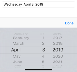
DatePicker

Allows the selection of a date.
Screenshot of a DatePicker
<DatePicker Format="D"
            VerticalOptions="CenterAndExpand" />

TimePicker

Allows the selection of a time.
Screenshot of a TimePicker
<TimePicker Format="T"
            VerticalOptions="CenterAndExpand" />

Views for editing text

Entry

Allows a single line of text to be entered and edited.
Screenshot of an Entry
<Entry Keyboard="Email"
       Placeholder="Enter email address"
       VerticalOptions="CenterAndExpand" />

Editor

Allows multiple lines of text to be entered and edited.
Screenshot of an Editor
<Editor VerticalOptions="FillAndExpand" />

Views to indicate activity

ActivityIndicator

Displays an animation to show that the application is engaged in a lengthy activity, without giving any indication of progress.
Screenshot of an ActivityIndicator
<ActivityIndicator IsRunning="True"
                   VerticalOptions="CenterAndExpand" />

ProgressBar

Displays an animation to show that the application is progressing through a lengthy activity.
Screenshot of a ProgressBar
<ProgressBar Progress=".5"
             VerticalOptions="CenterAndExpand" />

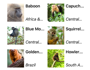
Views that display collections

CollectionView

Displays a scrollable list of selectable data items, using different layout specifications.
Screenshot of a CollectionView
<CollectionView ItemsSource="{Binding Monkeys}">
                ItemTemplate="{StaticResource MonkeyTemplate}"
    <CollectionView.ItemsLayout>
       <GridItemsLayout Orientation="Vertical"
                        Span="2" />
    </CollectionView.ItemsLayout>
</CollectionView/>

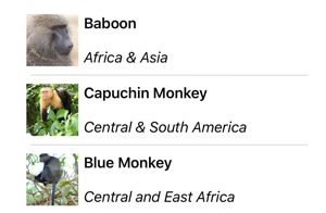
ListView

Displays a scrollable list of selectable data items.
Screenshot of a ListView
<ListView ItemsSource="{Binding Monkeys}">
          ItemTemplate="{StaticResource MonkeyTemplate}" />

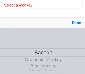
Picker

Displays a select item from a list of text strings.
Screenshot of a Picker
<Picker Title="Select a monkey"
        TitleColor="Red">
  <Picker.ItemsSource<
    <x:Array Type="{x:Type x:String}">
      <x:String>Baboon</x:String>
      <x:String>Capuchin Monkey</x:String>
      <x:String>Blue Monkey</x:String>
      <x:String>Squirrel Monkey</x:String>
      <x:String>Golden Lion Tamarin</x:String>
      <x:String>Howler Monkey</x:String>
      <x:String>Japanese Macaque</x:String>
    </x:Array>
  </Picker.ItemsSource>
</Picker>

TableView

Displays a list of interactive rows.
Screenshot of a TableView
<TableView Intent="Settings">
    <TableRoot>
        <TableSection Title="Ring">
            <SwitchCell Text="New Voice Mail" />
            <SwitchCell Text="New Mail" On="true" />
        </TableSection>
    </TableRoot>
</TableView>


Here is the list of controls which we will discuss one by one in this chapter.
Sr.No.Controls & Description
1Button
A control that responds to user input.
2Calendar
Represents a control that enables a user to select a date by using a visual calendar display.
3CheckBox
A control that a user can select or clear.
4ComboBox
A drop-down list of items a user can select from.
5ContextMenu
Gets or sets the context menu element that should appear whenever the context menu is requested through a user interface (UI) from within this element.
6DataGrid
Represents a control that displays data in a customizable grid.
7DatePicker
A control that lets a user select a date.
8Dialogs
An application may also display additional windows to the user to gather or display important information.
9GridView
A control that presents a collection of items in rows and columns that can scroll horizontally.
10Image
A control that presents an image.
11ListBox
A control that presents an inline list of items that the user can select from.
12Menus
Represents a Windows menu control that enables you to hierarchically organize elements associated with commands and event handlers.
13PasswordBox
A control for entering passwords.
14Popup
Displays content on top of existing content, within the bounds of the application window.
15ProgressBar
A control that indicates progress by displaying a bar.
16ProgressRing
A control that indicates indeterminate progress by displaying a ring.
17RadioButton
A control that allows a user to select a single option from a group of options.
18RichEditBox
A control that lets a user edit rich text documents with content like formatted text, hyperlinks, and images.
19ScrollViewer
A container control that lets the user pan and zoom its content.
20SearchBox
A control that lets a user enter search queries.
21Slider
A control that lets the user select from a range of values by moving a Thumb control along a track.
22TextBlock
A control that displays text.
23TimePicker
A control that lets a user set a time value.
24ToggleButton
A button that can be toggled between 2 states.
25ToolTip
A pop-up window that displays information for an element.
26Window
The root window which provides minimize/maximize option, Title bar, border and close button.

No comments:

Post a Comment

No String Argument Constructor/Factory Method to Deserialize From String Value

  In this short article, we will cover in-depth the   JsonMappingException: no String-argument constructor/factory method to deserialize fro...