Saturday, October 19, 2019

Creating XAML Markup Extensions

On the programmatic level, a XAML markup extension is a class that implements the IMarkupExtension or IMarkupExtension<T> interface. You can explore the source code of the standard markup extensions described below in the MarkupExtensions directory of the Xamarin.Forms GitHub repository.
It's also possible to define your own custom XAML markup extensions by deriving from IMarkupExtension or IMarkupExtension<T>. Use the generic form if the markup extension obtains a value of a particular type. This is the case with several of the Xamarin.Forms markup extensions:
  • TypeExtension derives from IMarkupExtension<Type>
  • ArrayExtension derives from IMarkupExtension<Array>
  • DynamicResourceExtension derives from IMarkupExtension<DynamicResource>
  • BindingExtension derives from IMarkupExtension<BindingBase>
  • ConstraintExpression derives from IMarkupExtension<Constraint>
The two IMarkupExtension interfaces define only one method each, named ProvideValue:
C#
public interface IMarkupExtension
{
object ProvideValue(IServiceProvider serviceProvider);
}
public interface IMarkupExtension<out T> : IMarkupExtension
{
new T ProvideValue(IServiceProvider serviceProvider);
}
Since IMarkupExtension<T> derives from IMarkupExtension and includes the new keyword on ProvideValue, it contains both ProvideValue methods.
Very often, XAML markup extensions define properties that contribute to the return value. (The obvious exception is NullExtension, in which ProvideValue simply returns null.) The ProvideValue method has a single argument of type IServiceProvider that will be discussed later in this article.

A Markup Extension for Specifying Color

The following XAML markup extension allows you to construct a Color value using hue, saturation, and luminosity components. It defines four properties for the four components of the color, including an alpha component that is initialized to 1. The class derives from IMarkupExtension<Color> to indicate a Color return value:
C#
public class HslColorExtension : IMarkupExtension<Color>
{
public double H { set; get; }
public double S { set; get; }
public double L { set; get; }
public double A { set; get; } = 1.0;
public Color ProvideValue(IServiceProvider serviceProvider)
{
return Color.FromHsla(H, S, L, A);
}
object IMarkupExtension.ProvideValue(IServiceProvider serviceProvider)
{
return (this as IMarkupExtension<Color>).ProvideValue(serviceProvider);
}
}
Because IMarkupExtension<T> derives from IMarkupExtension, the class must contain two ProvideValue methods, one that returns Color and another that returns object, but the second method can simply call the first method.
The HSL Color Demo page shows a variety of ways that HslColorExtension can appear in a XAML file to specify the color for a BoxView:
XAML
<ContentPage xmlns="http://xamarin.com/schemas/2014/forms"
xmlns:x="http://schemas.microsoft.com/winfx/2009/xaml"
xmlns:local="clr-namespace:MarkupExtensions"
x:Class="MarkupExtensions.HslColorDemoPage"
Title="HSL Color Demo">
<ContentPage.Resources>
<ResourceDictionary>
<Style TargetType="BoxView">
<Setter Property="WidthRequest" Value="80" />
<Setter Property="HeightRequest" Value="80" />
<Setter Property="HorizontalOptions" Value="Center" />
<Setter Property="VerticalOptions" Value="CenterAndExpand" />
</Style>
</ResourceDictionary>
</ContentPage.Resources>
<StackLayout>
<BoxView>
<BoxView.Color>
<local:HslColorExtension H="0" S="1" L="0.5" A="1" />
</BoxView.Color>
</BoxView>
<BoxView>
<BoxView.Color>
<local:HslColor H="0.33" S="1" L="0.5" />
</BoxView.Color>
</BoxView>
<BoxView Color="{local:HslColorExtension H=0.67, S=1, L=0.5}" />
<BoxView Color="{local:HslColor H=0, S=0, L=0.5}" />
<BoxView Color="{local:HslColor A=0.5}" />
</StackLayout>
</ContentPage>
Notice that when HslColorExtension is an XML tag, the four properties are set as attributes, but when it appears between curly braces, the four properties are separated by commas without quotation marks. The default values for HS, and L are 0, and the default value of A is 1, so those properties can be omitted if you want them set to default values. The last example shows an example where the luminosity is 0, which normally results in black, but the alpha channel is 0.5, so it is half transparent and appears gray against the white background of the page:
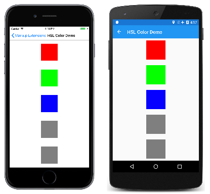
HSL Color Demo

A Markup Extension for Accessing Bitmaps

The argument to ProvideValue is an object that implements the IServiceProvider interface, which is defined in the .NET System namespace. This interface has one member, a method named GetService with a Type argument.
The ImageResourceExtension class shown below shows one possible use of IServiceProvider and GetService to obtain an IXmlLineInfoProvider object that can provide line and character information indicating where a particular error was detected. In this case, an exception is raised when the Source property has not been set:
C#
[ContentProperty("Source")]
class ImageResourceExtension : IMarkupExtension<ImageSource>
{
public string Source { set; get; }
public ImageSource ProvideValue(IServiceProvider serviceProvider)
{
if (String.IsNullOrEmpty(Source))
{
IXmlLineInfoProvider lineInfoProvider = serviceProvider.GetService(typeof(IXmlLineInfoProvider)) as IXmlLineInfoProvider;
IXmlLineInfo lineInfo = (lineInfoProvider != null) ? lineInfoProvider.XmlLineInfo : new XmlLineInfo();
throw new XamlParseException("ImageResourceExtension requires Source property to be set", lineInfo);
}
string assemblyName = GetType().GetTypeInfo().Assembly.GetName().Name;
return ImageSource.FromResource(assemblyName + "." + Source, typeof(ImageResourceExtension).GetTypeInfo().Assembly);
}
object IMarkupExtension.ProvideValue(IServiceProvider serviceProvider)
{
return (this as IMarkupExtension<ImageSource>).ProvideValue(serviceProvider);
}
}
ImageResourceExtension is helpful when a XAML file needs to access an image file stored as an embedded resource in the .NET Standard library project. It uses the Source property to call the static ImageSource.FromResource method. This method requires a fully-qualified resource name, which consists of the assembly name, the folder name, and the filename separated by periods. The second argument to the ImageSource.FromResource method provides the assembly name, and is only required for release builds on UWP. Regardless, ImageSource.FromResource must be called from the assembly that contains the bitmap, which means that this XAML resource extension cannot be part of an external library unless the images are also in that library. 
Although ImageResourceExtension requires the Source property to be set, the Source property is indicated in an attribute as the content property of the class. This means that the Source= part of the expression in curly braces can be omitted. In the Image Resource Demo page, the Image elements fetch two images using the folder name and the filename separated by periods:
XAML
<ContentPage xmlns="http://xamarin.com/schemas/2014/forms"
xmlns:x="http://schemas.microsoft.com/winfx/2009/xaml"
xmlns:local="clr-namespace:MarkupExtensions"
x:Class="MarkupExtensions.ImageResourceDemoPage"
Title="Image Resource Demo">
<Grid>
<Grid.RowDefinitions>
<RowDefinition Height="*" />
</Grid.RowDefinitions>
<Image Source="{local:ImageResource Images.SeatedMonkey.jpg}"
Grid.Row="0" />
<Image Source="{local:ImageResource Images.FacePalm.jpg}"
Grid.Row="1" />
</Grid>
</ContentPage>
Here's the program running:
Image Resource Demo

Service Providers

By using the IServiceProvider argument to ProvideValue, XAML markup extensions can get access to helpful information about the XAML file in which they're being used. But to use the IServiceProvider argument successfully, you need to know what kind of services are available in particular contexts. The best way to get an understanding of this feature is by studying the source code of existing XAML markup extensions in the MarkupExtensions folder in the Xamarin.Forms repository on GitHub. Be aware that some types of services are internal to Xamarin.Forms.
In some XAML markup extensions, this service might be useful:
C#
 IProvideValueTarget provideValueTarget = serviceProvider.GetService(typeof(IProvideValueTarget)) as IProvideValueTarget;
The IProvideValueTarget interface defines two properties, TargetObject and TargetProperty. When this information is obtained in the ImageResourceExtension class, TargetObject is the Image and TargetProperty is a BindableProperty object for the Source property of Image. This is the property on which the XAML markup extension has been set.
The GetService call with an argument of typeof(IProvideValueTarget) actually returns an object of type SimpleValueTargetProvider, which is defined in the Xamarin.Forms.Xaml.Internals namespace. If you cast the return value of GetService to that type, you can also access a ParentObjects property, which is an array that contains the Image element, the Grid parent, and the ImageResourceDemoPage parent of the Grid.
Consuming XAML Markup Extensions

XAML markup extensions help enhance the power and flexibility of XAML by allowing element attributes to be set from a variety of sources. Several XAML markup extensions are part of the XAML 2009 specification. These appear in XAML files with the customary x namespace prefix, and are commonly referred to with this prefix. This article discusses the following markup extensions:
  • x:Static – reference static properties, fields, or enumeration members.
  • x:Reference – reference named elements on the page.
  • x:Type – set an attribute to a System.Type object.
  • x:Array – construct an array of objects of a particular type.
  • x:Null – set an attribute to a null value.
  • OnPlatform – customize UI appearance on a per-platform basis.
  • OnIdiom – customize UI appearance based on the idiom of the device the application is running on.
  • DataTemplate - converts a type into a DataTemplate.
  • FontImage - display a font icon in any view that can display an ImageSource.
Additional XAML markup extensions have historically been supported by other XAML implementations, and are also supported by Xamarin.Forms. These are described more fully in other articles:
  • StaticResource – reference objects from a resource dictionary, as described in the article Resource Dictionaries.
  • DynamicResource – respond to changes in objects in a resource dictionary, as described in the article Dynamic Styles.
  • Binding – establish a link between properties of two objects, as described in the article Data Binding.
  • TemplateBinding – performs data binding from a control template, as discussed in the article Binding from a Control Template.
The RelativeLayout layout makes use of the custom markup extension ConstraintExpression. This markup extension is described in the article RelativeLayout.

x:Static Markup Extension

The x:Static markup extension is supported by the StaticExtension class. The class has a single property named Member of type string that you set to the name of a public constant, static property, static field, or enumeration member.
One common way to use x:Static is to first define a class with some constants or static variables, such as this tiny AppConstants class in the MarkupExtensions program:
C#
static class AppConstants
{
public static double NormalFontSize = 18;
}
The x:Static Demo page demonstrates several ways to use the x:Static markup extension. The most verbose approach instantiates the StaticExtension class between Label.FontSize property-element tags:
XAML
<ContentPage xmlns="http://xamarin.com/schemas/2014/forms"
xmlns:x="http://schemas.microsoft.com/winfx/2009/xaml"
xmlns:sys="clr-namespace:System;assembly=mscorlib"
xmlns:local="clr-namespace:MarkupExtensions"
x:Class="MarkupExtensions.StaticDemoPage"
Title="x:Static Demo">
<StackLayout Margin="10, 0">
<Label Text="Label No. 1">
<Label.FontSize>
<x:StaticExtension Member="local:AppConstants.NormalFontSize" />
</Label.FontSize>
</Label>
···
</StackLayout>
</ContentPage>
The XAML parser also allows the StaticExtension class to be abbreviated as x:Static:
XAML
<Label Text="Label No. 2">
<Label.FontSize>
<x:Static Member="local:AppConstants.NormalFontSize" />
</Label.FontSize>
</Label>
This can be simplified even further, but the change introduces some new syntax: It consists of putting the StaticExtension class and the member setting in curly braces. The resulting expression is set directly to the FontSize attribute:
XAML
<Label Text="Label No. 3"
FontSize="{x:StaticExtension Member=local:AppConstants.NormalFontSize}" />
Notice that there are no quotation marks within the curly braces. The Member property of StaticExtension is no longer an XML attribute. It is instead part of the expression for the markup extension.
Just as you can abbreviate x:StaticExtension to x:Static when you use it as an object element, you can also abbreviate it in the expression within curly braces:
XAML
<Label Text="Label No. 4"
FontSize="{x:Static Member=local:AppConstants.NormalFontSize}" />
The StaticExtension class has a ContentProperty attribute referencing the property Member, which marks this property as the class's default content property. For XAML markup extensions expressed with curly braces, you can eliminate the Member= part of the expression:
XAML
<Label Text="Label No. 5"
FontSize="{x:Static local:AppConstants.NormalFontSize}" />
This is the most common form of the x:Static markup extension.
The Static Demo page contains two other examples. The root tag of the XAML file contains an XML namespace declaration for the .NET System namespace:
XAML
xmlns:sys="clr-namespace:System;assembly=mscorlib"
This allows the Label font size to be set to the static field Math.PI. That results in rather small text, so the Scale property is set to Math.E:
XAML
<Label Text="&#x03C0; &#x00D7; E sized text"
FontSize="{x:Static sys:Math.PI}"
Scale="{x:Static sys:Math.E}"
HorizontalOptions="Center" />
The final example displays the Device.RuntimePlatform value. The Environment.NewLine static property is used to insert a new-line character between the two Span objects:
XAML
<Label HorizontalTextAlignment="Center"
FontSize="{x:Static local:AppConstants.NormalFontSize}">
<Label.FormattedText>
<FormattedString>
<Span Text="Runtime Platform: " />
<Span Text="{x:Static sys:Environment.NewLine}" />
<Span Text="{x:Static Device.RuntimePlatform}" />
</FormattedString>
</Label.FormattedText>
</Label>
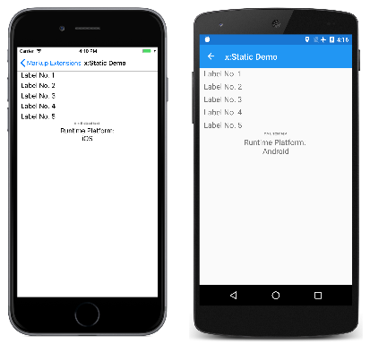
Here's the sample running:
x:Static Demo

x:Reference Markup Extension

The x:Reference markup extension is supported by the ReferenceExtension class. The class has a single property named Name of type string that you set to the name of an element on the page that has been given a name with x:Name. This Name property is the content property of ReferenceExtension, so Name= is not required when x:Reference appears in curly braces.
The x:Reference markup extension is used exclusively with data bindings, which are described in more detail in the article Data Binding.
The x:Reference Demo page shows two uses of x:Reference with data bindings, the first where it's used to set the Source property of the Binding object, and the second where it's used to set the BindingContext property for two data bindings:
XAML
<ContentPage xmlns="http://xamarin.com/schemas/2014/forms"
xmlns:x="http://schemas.microsoft.com/winfx/2009/xaml"
x:Class="MarkupExtensions.ReferenceDemoPage"
x:Name="page"
Title="x:Reference Demo">
<StackLayout Margin="10, 0">
<Label Text="{Binding Source={x:Reference page},
StringFormat='The type of this page is {0}'}"
FontSize="18"
VerticalOptions="CenterAndExpand"
HorizontalTextAlignment="Center" />
<Slider x:Name="slider"
Maximum="360"
VerticalOptions="Center" />
<Label BindingContext="{x:Reference slider}"
Text="{Binding Value, StringFormat='{0:F0}&#x00B0; rotation'}"
Rotation="{Binding Value}"
FontSize="24"
HorizontalOptions="Center"
VerticalOptions="CenterAndExpand" />
</StackLayout>
</ContentPage>
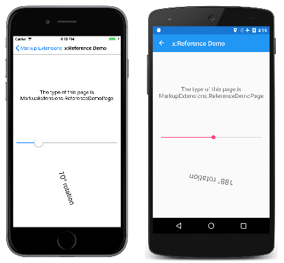
Both x:Reference expressions use the abbreviated version of the ReferenceExtension class name and eliminate the Name= part of the expression. In the first example, the x:Reference markup extension is embedded in the Binding markup extension. Notice that the Source and StringFormat settings are separated by commas. Here's the program running:
x:Reference Demo

x:Type Markup Extension

The x:Type markup extension is the XAML equivalent of the C# typeof keyword. It is supported by the TypeExtension class, which defines one property named TypeName of type string that is set to a class or structure name. The x:Type markup extension returns the System.Type object of that class or structure. TypeName is the content property of TypeExtension, so TypeName= is not required when x:Type appears with curly braces.
Within Xamarin.Forms, there are several properties that have arguments of type Type. Examples include the TargetType property of Style, and the x:TypeArguments attribute used to specify arguments in generic classes. However, the XAML parser performs the typeof operation automatically, and the x:Type markup extension is not used in these cases.
One place where x:Type is required is with the x:Array markup extension, which is described in the next section.
The x:Type markup extension is also useful when constructing a menu where each menu item corresponds to an object of a particular type. You can associate a Type object with each menu item, and then instantiate the object when the menu item is selected.
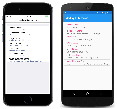
This is how the navigation menu in MainPage in the Markup Extensions program works. The MainPage.xaml file contains a TableView with each TextCell corresponding to a particular page in the program:
XAML
<ContentPage xmlns="http://xamarin.com/schemas/2014/forms"
xmlns:x="http://schemas.microsoft.com/winfx/2009/xaml"
xmlns:local="clr-namespace:MarkupExtensions"
x:Class="MarkupExtensions.MainPage"
Title="Markup Extensions"
Padding="10">
<TableView Intent="Menu">
<TableRoot>
<TableSection>
<TextCell Text="x:Static Demo"
Detail="Access constants or statics"
Command="{Binding NavigateCommand}"
CommandParameter="{x:Type local:StaticDemoPage}" />
<TextCell Text="x:Reference Demo"
Detail="Reference named elements on the page"
Command="{Binding NavigateCommand}"
CommandParameter="{x:Type local:ReferenceDemoPage}" />
<TextCell Text="x:Type Demo"
Detail="Associate a Button with a Type"
Command="{Binding NavigateCommand}"
CommandParameter="{x:Type local:TypeDemoPage}" />
<TextCell Text="x:Array Demo"
Detail="Use an array to fill a ListView"
Command="{Binding NavigateCommand}"
CommandParameter="{x:Type local:ArrayDemoPage}" />
···
</TableRoot>
</TableView>
</ContentPage>
Here's the opening main page in Markup Extensions:
Main Page
Each CommandParameter property is set to an x:Type markup extension that references one of the other pages. The Command property is bound to a property named NavigateCommand. This property is defined in the MainPage code-behind file:
C#
public partial class MainPage : ContentPage
{
public MainPage()
{
InitializeComponent();
NavigateCommand = new Command<Type>(async (Type pageType) =>
{
Page page = (Page)Activator.CreateInstance(pageType);
await Navigation.PushAsync(page);
});
BindingContext = this;
}
public ICommand NavigateCommand { private set; get; }
}
The NavigateCommand property is a Command object that implements an execute command with an argument of type Type — the value of CommandParameter. The method uses Activator.CreateInstance to instantiate the page and then navigates to it. The constructor concludes by setting the BindingContext of the page to itself, which enables the Binding on Command to work. See the Data Binding article and particularly the Commanding article for more details about this type of code.
The x:Type Demo page uses a similar technique to instantiate Xamarin.Forms elements and to add them to a StackLayout. The XAML file initially consists of three Button elements with their Command properties set to a Binding and the CommandParameter properties set to types of three Xamarin.Forms views:
XAML
<ContentPage xmlns="http://xamarin.com/schemas/2014/forms"
xmlns:x="http://schemas.microsoft.com/winfx/2009/xaml"
x:Class="MarkupExtensions.TypeDemoPage"
Title="x:Type Demo">
<StackLayout x:Name="stackLayout"
Padding="10, 0">
<Button Text="Create a Slider"
HorizontalOptions="Center"
VerticalOptions="CenterAndExpand"
Command="{Binding CreateCommand}"
CommandParameter="{x:Type Slider}" />
<Button Text="Create a Stepper"
HorizontalOptions="Center"
VerticalOptions="CenterAndExpand"
Command="{Binding CreateCommand}"
CommandParameter="{x:Type Stepper}" />
<Button Text="Create a Switch"
HorizontalOptions="Center"
VerticalOptions="CenterAndExpand"
Command="{Binding CreateCommand}"
CommandParameter="{x:Type Switch}" />
</StackLayout>
</ContentPage>
The code-behind file defines and initializes the CreateCommand property:
C#
public partial class TypeDemoPage : ContentPage
{
public TypeDemoPage()
{
InitializeComponent();
CreateCommand = new Command<Type>((Type viewType) =>
{
View view = (View)Activator.CreateInstance(viewType);
view.VerticalOptions = LayoutOptions.CenterAndExpand;
BindingContext = this;
stackLayout.Children.Add(view); });
}
public ICommand CreateCommand { private set; get; }
}
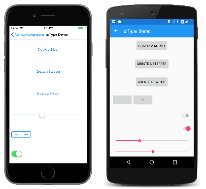
The method that is executed when a Button is pressed creates a new instance of the argument, sets its VerticalOptions property, and adds it to the StackLayout. The three Button elements then share the page with dynamically created views:
x:Type Demo

x:Array Markup Extension

The x:Array markup extension allows you to define an array in markup. It is supported by the ArrayExtension class, which defines two properties:
  • Type of type Type, which indicates the type of the elements in the array.
  • Items of type IList, which is a collection of the items themselves. This is the content property of ArrayExtension.
The x:Array markup extension itself never appears in curly braces. Instead, x:Array start and end tags delimit the list of items. Set the Type property to an x:Type markup extension.
The x:Array Demo page shows how to use x:Array to add items to a ListView by setting the ItemsSource property to an array:
XAML
<ContentPage xmlns="http://xamarin.com/schemas/2014/forms"
xmlns:x="http://schemas.microsoft.com/winfx/2009/xaml"
x:Class="MarkupExtensions.ArrayDemoPage"
Title="x:Array Demo Page">
<ListView Margin="10">
<ListView.ItemsSource>
<x:Array Type="{x:Type Color}">
<Color>Aqua</Color>
<Color>Black</Color>
<Color>Blue</Color>
<Color>Fuchsia</Color>
<Color>Gray</Color>
<Color>Green</Color>
<Color>Lime</Color>
<Color>Maroon</Color>
<Color>Navy</Color>
<Color>Olive</Color>
<Color>Pink</Color>
<Color>Purple</Color>
<Color>Red</Color>
<Color>Silver</Color>
<Color>Teal</Color>
<Color>White</Color>
<Color>Yellow</Color>
</x:Array>
</ListView.ItemsSource>
<ListView.ItemTemplate>
<DataTemplate>
<ViewCell>
<BoxView Color="{Binding}"
Margin="3" />
</ViewCell>
</DataTemplate>
</ListView.ItemTemplate>
</ListView>
</ContentPage>
The ViewCell creates a simple BoxView for each color entry:
x:Array Demo
There are several ways to specify the individual Color items in this array. You can use an x:Static markup extension:
XAML
<x:Static Member="Color.Blue" />
Or, you can use StaticResource to retrieve a color from a resource dictionary:
XAML
<StaticResource Key="myColor" />
Towards the end of this article, you'll see a custom XAML markup extension that also creates a new color value:
XAML
<local:HslColor H="0.5" S="1.0" L="0.5" />
When defining arrays of common types like strings or numbers, use the tags listed in the Passing Constructor Arguments article to delimit the values.

x:Null Markup Extension

The x:Null markup extension is supported by the NullExtension class. It has no properties and is simply the XAML equivalent of the C# null keyword.
The x:Null markup extension is rarely needed and seldom used, but if you do find a need for it, you'll be glad that it exists.
The x:Null Demo page illustrates one scenario when x:Null might be convenient. Suppose that you define an implicit Style for Label that includes a Setter that sets the FontFamily property to a platform-dependent family name:
XAML
<ContentPage xmlns="http://xamarin.com/schemas/2014/forms"
xmlns:x="http://schemas.microsoft.com/winfx/2009/xaml"
x:Class="MarkupExtensions.NullDemoPage"
Title="x:Null Demo">
<ContentPage.Resources>
<ResourceDictionary>
<Style TargetType="Label">
<Setter Property="FontSize" Value="48" />
<Setter Property="FontFamily">
<Setter.Value>
<OnPlatform x:TypeArguments="x:String">
<On Platform="iOS" Value="Times New Roman" />
<On Platform="Android" Value="serif" />
<On Platform="UWP" Value="Times New Roman" />
</OnPlatform>
</Setter.Value>
</Setter>
</Style>
</ResourceDictionary>
</ContentPage.Resources>
<ContentPage.Content>
<StackLayout Padding="10, 0">
<Label Text="Text 1" />
<Label Text="Text 2" />
<Label Text="Text 3"
FontFamily="{x:Null}" />
<Label Text="Text 4" />
<Label Text="Text 5" />
</StackLayout>
</ContentPage.Content>
</ContentPage>
Then you discover that for one of the Label elements, you want all the property settings in the implicit Style except for the FontFamily, which you want to be the default value. You could define another Style for that purpose but a simpler approach is simply to set the FontFamily property of the particular Label to x:Null, as demonstrated in the center Label.
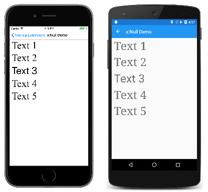
Here's the program running:
x:Null Demo
Notice that four of the Label elements have a serif font, but the center Label has the default sans-serif font.

OnPlatform Markup Extension

The OnPlatform markup extension allows you to customize UI appearance on a per-platform basis. It provides the same functionality as the OnPlatform and On classes, but with a more concise representation.
The OnPlatform markup extension is supported by the OnPlatformExtension class, which defines the following properties:
  • Default of type object, that you set to a default value to be applied to the properties that represent platforms.
  • Android of type object, that you set to a value to be applied on Android.
  • GTK of type object, that you set to a value to be applied on GTK platforms.
  • iOS of type object, that you set to a value to be applied on iOS.
  • macOS of type object, that you set to a value to be applied on macOS.
  • Tizen of type object, that you set to a value to be applied on the Tizen platform.
  • UWP of type object, that you set to a value to be applied on the Universal Windows Platform.
  • WPF of type object, that you set to a value to be applied on the Windows Presentation Foundation platform.
  • Converter of type IValueConverter, that you set to an IValueConverter implementation.
  • ConverterParameter of type object, that you set to a value to pass to the IValueConverter implementation.
 Note
The XAML parser allows the OnPlatformExtension class to be abbreviated as OnPlatform.
The Default property is the content property of OnPlatformExtension. Therefore, for XAML markup expressions expressed with curly braces, you can eliminate the Default= part of the expression provided that it's the first argument.
 Important
The XAML parser expects that values of the correct type will be provided to properties consuming the OnPlatform markup extension. If type conversion is necessary, the OnPlatform markup extension will attempt to perform it using the default converters provided by Xamarin.Forms. However, there are some type conversions that can't be performed by the default converters and in these cases the Converter property should be set to an IValueConverter implementation.
The OnPlatform Demo page shows how to use the OnPlatform markup extension:
XAML
<BoxView Color="{OnPlatform Yellow, iOS=Red, Android=Green, UWP=Blue}"
WidthRequest="{OnPlatform 250, iOS=200, Android=300, UWP=400}"
HeightRequest="{OnPlatform 250, iOS=200, Android=300, UWP=400}"
HorizontalOptions="Center" />
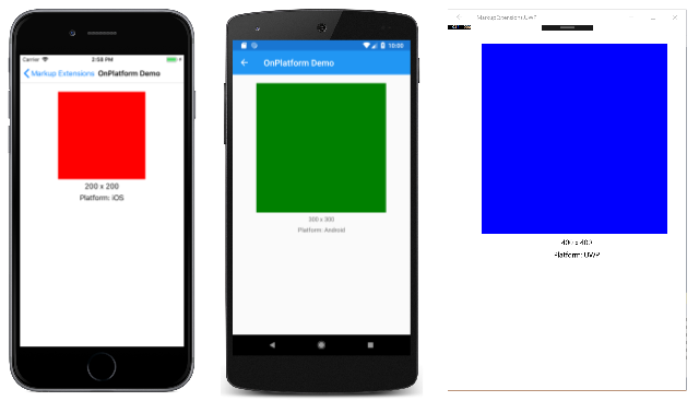
In this example, all three OnPlatform expressions use the abbreviated version of the OnPlatformExtension class name. The three OnPlatform markup extensions set the Color, WidthRequest, and HeightRequest properties of the BoxView to different values on iOS, Android, and UWP. The markup extensions also provide default values for these properties on the platforms that aren't specified, while eliminating the Default= part of the expression. Notice that the markup extension properties that are set are separated by commas.
Here's the program running:
OnPlatform Demo

OnIdiom Markup Extension

The OnIdiom markup extension allows you to customize UI appearance based on the idiom of the device the application is running on. It's supported by the OnIdiomExtension class, which defines the following properties:
  • Default of type object, that you set to a default value to be applied to the properties that represent device idioms.
  • Phone of type object, that you set to a value to be applied on phones.
  • Tablet of type object, that you set to a value to be applied on tablets.
  • Desktop of type object, that you set to a value to be applied on desktop platforms.
  • TV of type object, that you set to a value to be applied on TV platforms.
  • Watch of type object, that you set to a value to be applied on Watch platforms.
  • Converter of type IValueConverter, that you set to an IValueConverter implementation.
  • ConverterParameter of type object, that you set to a value to pass to the IValueConverter implementation.
 Note
The XAML parser allows the OnIdiomExtension class to be abbreviated as OnIdiom.
The Default property is the content property of OnIdiomExtension. Therefore, for XAML markup expressions expressed with curly braces, you can eliminate the Default= part of the expression provided that it's the first argument.
 Important
The XAML parser expects that values of the correct type will be provided to properties consuming the OnIdiom markup extension. If type conversion is necessary, the OnIdiom markup extension will attempt to perform it using the default converters provided by Xamarin.Forms. However, there are some type conversions that can't be performed by the default converters and in these cases the Converter property should be set to an IValueConverter implementation.
The OnIdiom Demo page shows how to use the OnIdiom markup extension:
XAML
<BoxView Color="{OnIdiom Yellow, Phone=Red, Tablet=Green, Desktop=Blue}"
WidthRequest="{OnIdiom 100, Phone=200, Tablet=300, Desktop=400}"
HeightRequest="{OnIdiom 100, Phone=200, Tablet=300, Desktop=400}"
HorizontalOptions="Center" />
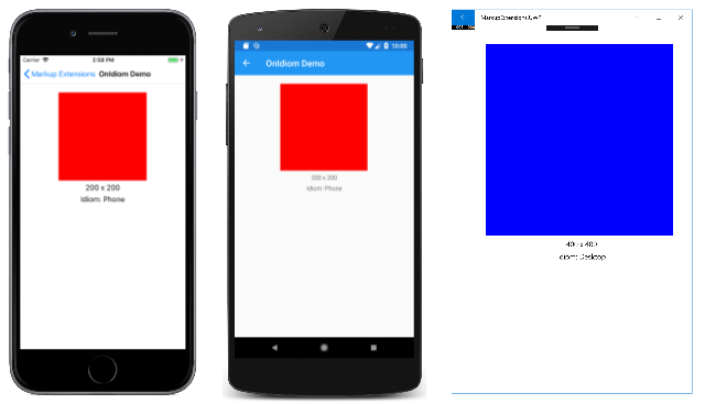
In this example, all three OnIdiom expressions use the abbreviated version of the OnIdiomExtension class name. The three OnIdiom markup extensions set the Color, WidthRequest, and HeightRequest properties of the BoxView to different values on the phone, tablet, and desktop idioms. The markup extensions also provide default values for these properties on the idioms that aren't specified, while eliminating the Default= part of the expression. Notice that the markup extension properties that are set are separated by commas.
Here's the program running:
OnIdiom Demo

DataTemplate Markup Extension

The DataTemplate markup extension allows you to convert a type into a DataTemplate. It's supported by the DataTemplateExtension class, which defines a TypeName property, of type string, that is set to the name of the type to be converted into a DataTemplate. The TypeName property is the content property of DataTemplateExtension. Therefore, for XAML markup expressions expressed with curly braces, you can eliminate the TypeName= part of the expression.
 Note
The XAML parser allows the DataTemplateExtension class to be abbreviated as DataTemplate.
A typical usage of this markup extension is in a Shell application, as shown in the following example:
XAML
<ShellContent Title="Monkeys"
Icon="monkey.png"
ContentTemplate="{DataTemplate views:MonkeysPage}" />
In this example, MonkeysPage is converted from a ContentPage to a DataTemplate, which is set as the value of the ShellContent.ContentTemplate property. This ensures that MonkeysPage is only created when navigation to the page occurs, rather than at application startup.

FontImage Markup Extension

The FontImage markup extension allows you to display a font icon in any view that can display an ImageSource. It provides the same functionality as the FontImageSource class, but with a more concise representation.
The FontImage markup extension is supported by the FontImageExtension class, which defines the following properties:
  • FontFamily of type string, the font family to which the font icon belongs.
  • Glyph of type string, the unicode character value of the font icon.
  • Color of type Color, the color to be used when displaying the font icon.
  • Size of type double, the size, in device-independent units, of the rendered font icon.
 Note:
The XAML parser allows the FontImageExtension class to be abbreviated as FontImage.
The Glyph property is the content property of FontImageExtension. Therefore, for XAML markup expressions expressed with curly braces, you can eliminate the Glyph= part of the expression provided that it's the first argument.
The FontImage Demo page shows how to use the FontImage markup extension:
XAML
<Image BackgroundColor="#D1D1D1"
Source="{FontImage &#xf30c;, FontFamily={OnPlatform iOS=Ionicons, Android=ionicons.ttf#}, Size=44}" />
In this example, the abbreviated version of the FontImageExtension class name is used to display an XBox icon, from the Ionicons font family, in an Image. The expression also uses the OnPlatform markup extension to specify different FontFamily property values on iOS and Android. In addition, the Glyph= part of the expression is eliminated, and the markup extension properties that are set are separated by commas. Note that while the unicode character for the icon is \uf30c, it has to be escaped in XAML and so becomes &#xf30c;.
Here's the program running:

Screenshot of the FontImage markup extension

No String Argument Constructor/Factory Method to Deserialize From String Value

  In this short article, we will cover in-depth the   JsonMappingException: no String-argument constructor/factory method to deserialize fro...